Check out an updated version of this post! Find current examples and even more great information: Using team photos to improve your conversion rate
Are there REAL people working at your company?
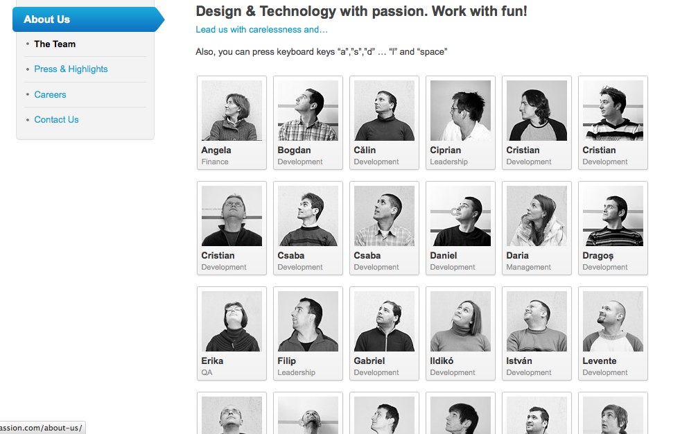
When your potential clients stumble upon your business’s website, one of the first things they do is look for examples of your work. But what happens when they look at your team page and only see names of your employees? Some “About Us” pages don’t even have their employees listed, some have their names and some have their pictures. Along with their just names or pictures comes bios and all that jazz, but who wins in the fight between names and pictures? When it comes down to it, your clients feel more comfortable knowing that they are working with a REAL person. Having images along with names on your “About Us” page helps clients realize this, which in increases your conversion rate. The article by unbounce titled “3 Ways to Increase Your Conversion Rate with Images [Case Studies]” put it this way:
“How can you create a better connection with customers if they won’t meet you in person the majority of the time? The answer is to use images wisely, both on the sales and service side of your pages. … It’s hard to connect with a small business team with a huge list of names. Get personal with customers and allow them to connect with you more easily by implementing images.”
This is completely true. I have some examples listed below and to come up with them was a little difficult.
Why is showing your team’s faces so beneficial?
It allows people to emotionally invest in a relationship with your business if they can actually see who they are talking to/working with. To me, it’s almost like when you call your cable company and you have to go through a bunch of recorded questions until you actually talk to a human being. Having a picture and bio on your about page will create a sense of “Hey, they’re a person just like me”. Using images of people in other sections of your website also helps in making your business more personable.
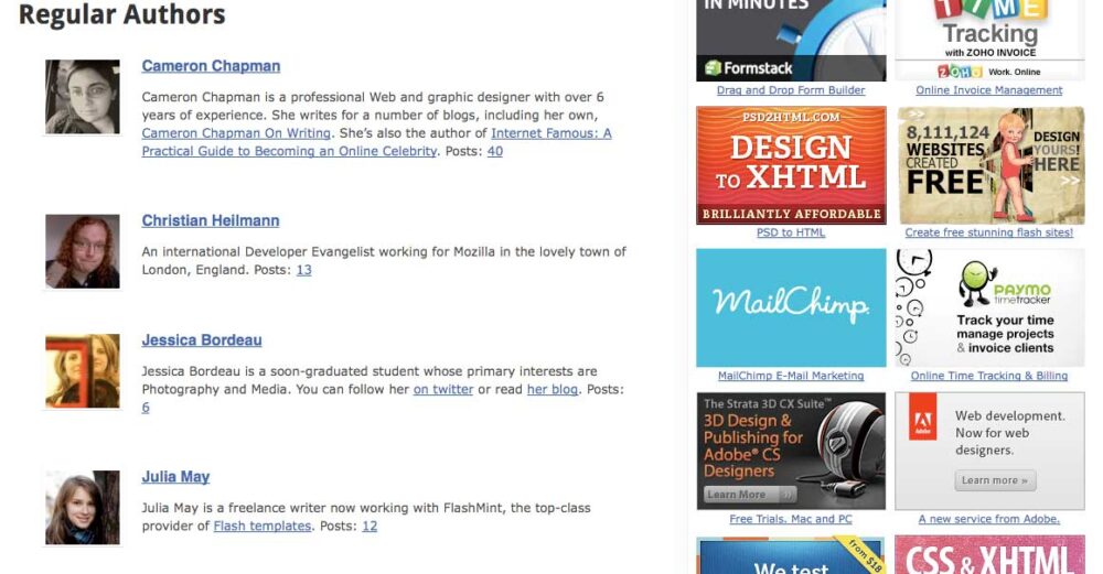
One great example: If you have a blog, in the author section, post their image along with their name. This way, people who read it can see who actually wrote such an informative blog post. These tactics help build a great relationship with your clients.
Great Examples
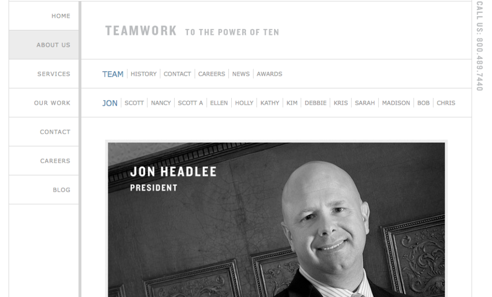
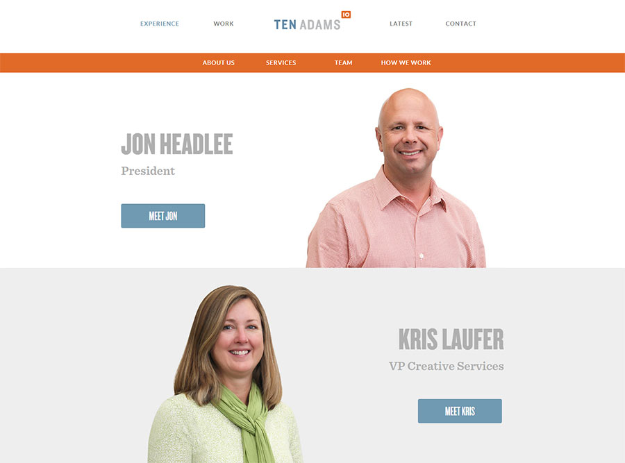
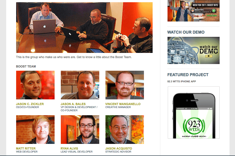
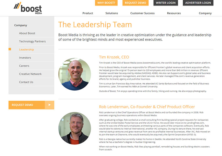
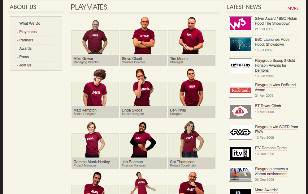
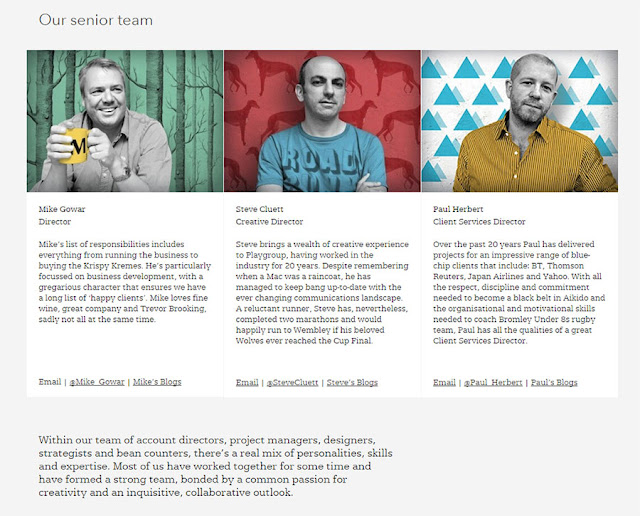
Update: Scroll through the examples below to see a historical record of team pages from 2011 (when this post was originally published) and their 2016 counterparts. Notice any differences?
Ten Adams
Boost Media
First Person
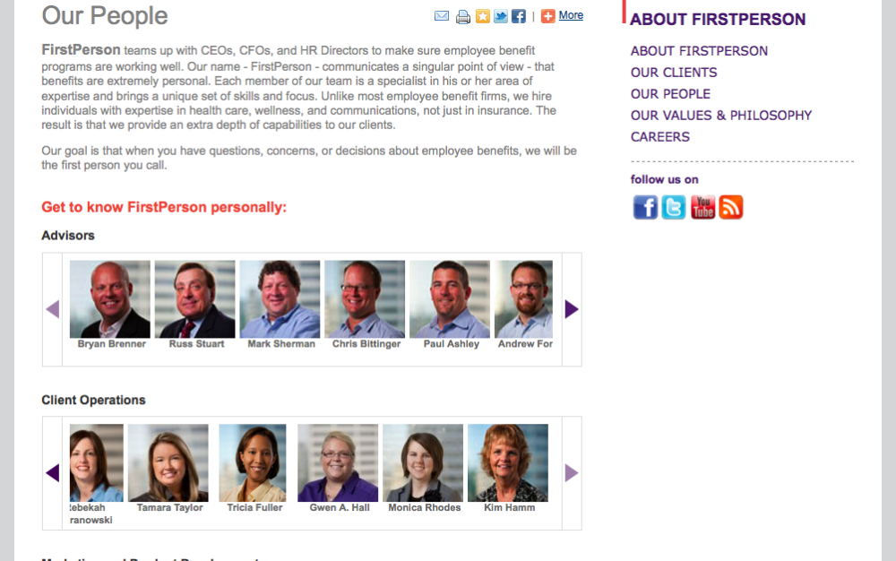
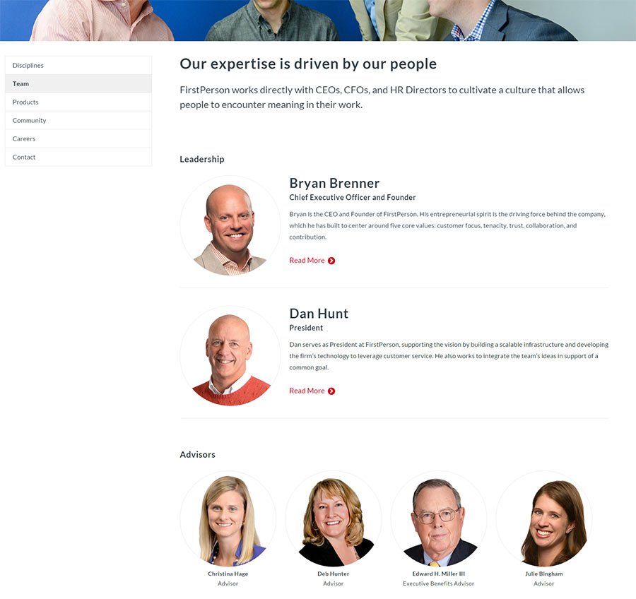
Play Group
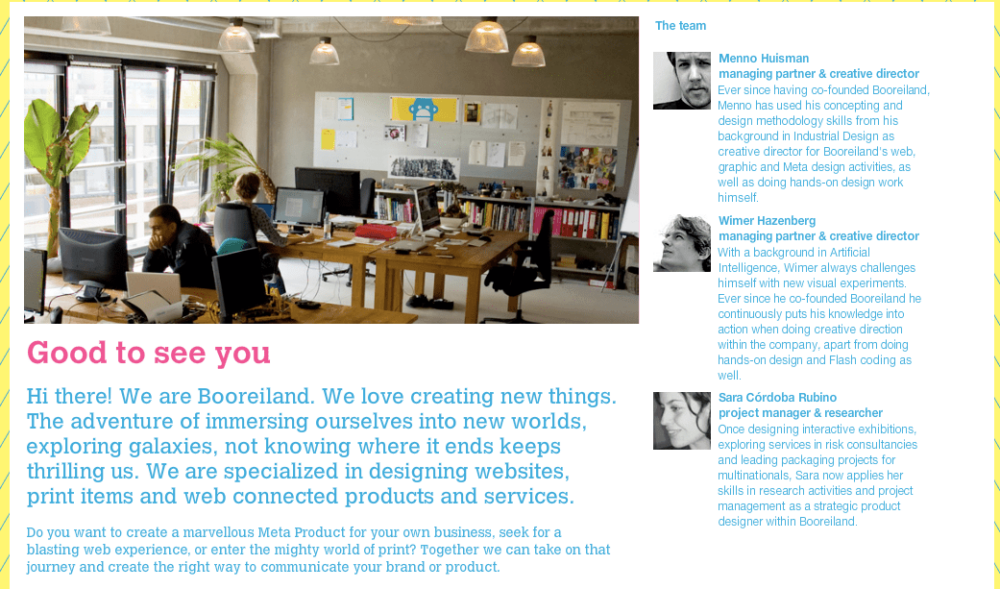
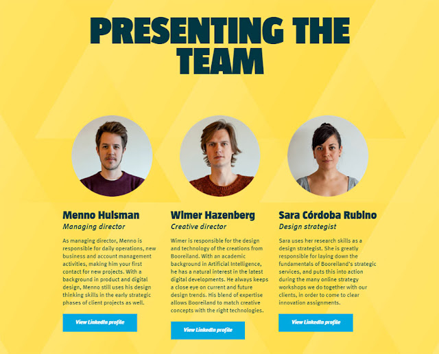
HelloWallet
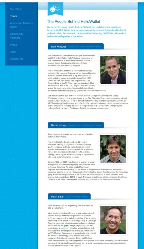
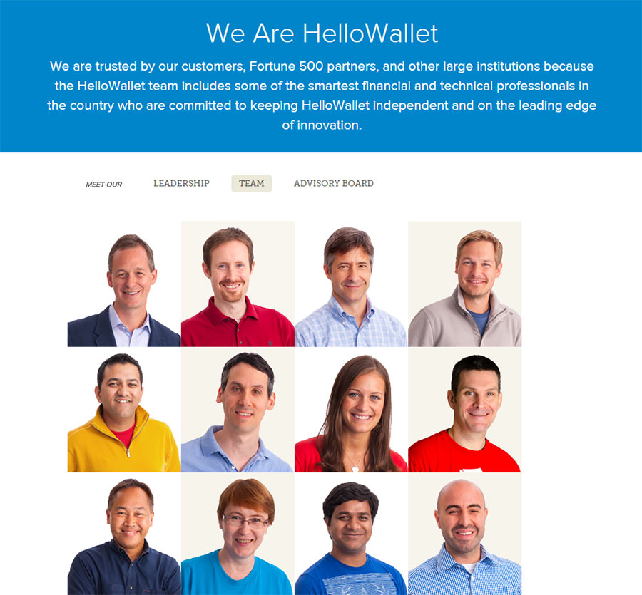
Like many other aspects of life, website design can operate on the “if it isn’t broken, don’t fix it” principle at times. Check out these About Us staff pages that haven’t changed since 2011.
Lateral
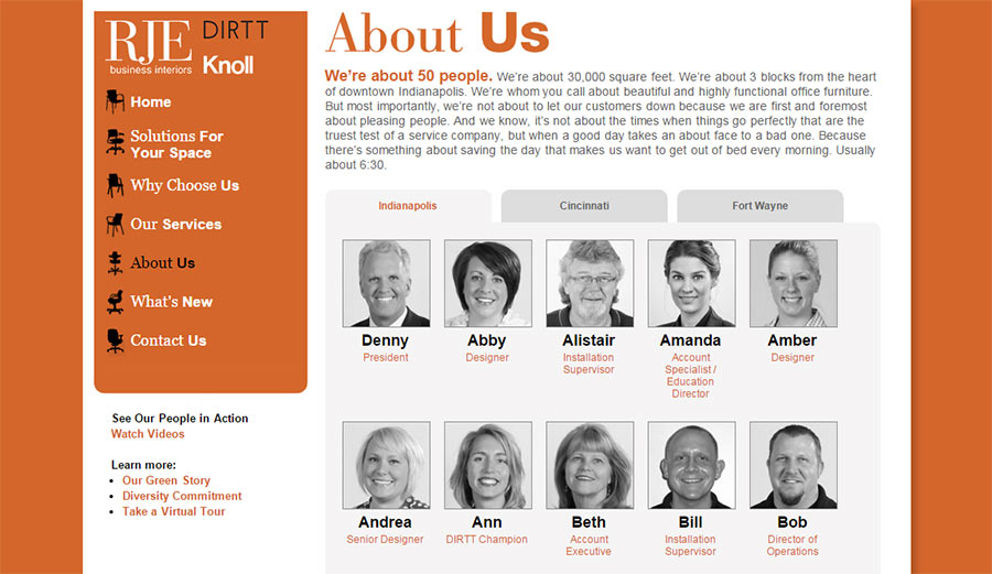
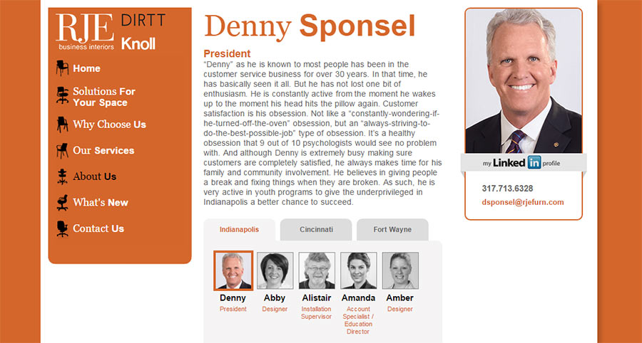
TBH Creative redesigned RJE Business Interior’s About Staff page in 2011. In general, we chose to use first names on the first page to compliment the introduction text and casual tone throughout the website. We wanted to make sure the visitor knew the faces were clickable for ‘more’, so the hover state is clearly marked with an orange border in either option.
Let your clients know that your people are really people and not robots.
TBH Creative can help you decide the best way to achieve this by brainstorming a website redesign for your “About” page and other web strategies to increase your conversion rate.

