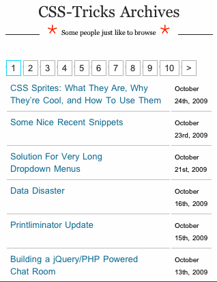
As smart phones continue to climb in popularity, mobile web design is becoming extremely important for visibility and your online ‘image’. And since the iPhone is now available for Verizon, more people will be joining the crowd with touch screen smart phones.
Mobile web design is important for your business. Why? Because your audience (clients, partners, supporters) are using their phones to find you and read about your business. They will be frustrated if your website does not work for them on their phones. This trend is not going anywhere. If anything, it will become more and more important in 2011.
Below are some important things to consider while creating a design for a phone.
Usability
Aesthetics and usability go hand in hand when designing for a computer screen, but as far as mobile design goes, usability is a MUST. Usability is how easy your website is to ‘use’ (e.g. find what they are looking for) for your visitors. Navigation should remain simple — an easy tap to take the user to the corresponding page. Drop down menus should be used with discretion because they are more difficult to click with a touch screen phone and ‘jumpy’ movement.
Links
There are small details that you can add into a mobile design. Sure email links are always important on a computer and a phone, but now a phone number can be a link to click and call that number directly. iPhone’s automatically have phone numbers set to call, but for other mobile phones you can add a snippet of code to make it clickable. Also remember the size of your links — they big enough for the user to click with ease.
More helpful hints can be found in Abduzeedo’s blog about mobile web design.
Also, don’t forget to add social media buttons because they are becoming very important. Read our blog about using Facebook for your business to find out why.

Design
Design should remain simple and at a minimalistic.
White space, white space, white space. An example is Mashable.com. They have created a lot of white space and simple navigation so that the user is not confused or searching through it. The white space also leads the user straight to the content so that they can scroll through the entries easily.
Screen Size
Another thing to keep in mind while creating a design is the width and height as well as resolution. Web phones displays range from 128×160 pixels to 320×480 pixels (iPhone).
Examples of great Mobile Web Design


