What makes a great Twitter design? The answers is simplicity, color thought and personality. Simplicity and choosing the right colors are the key factors but having personality makes you stand out from the rest.
Design Rules
Keep your background as simple as can be. You could create a nice, repeating background or a design that has something to feature either on the right or left-side. Have a design on both sides typically creates clutter.
As a business, it is a good idea to get your logo in the background along with contact information, a tagline, or short description of the company services. The new transparent side of the content adds a twist for your design — it’s an opportunity to use your business logo to lay behind the content AND you can make it large.
Color selection is important. It is also a good idea to stick with the color palette of your website. Twitter allows you to define colors for background, text, links, sidebar, and sidebar border. Choosing the right colors within the restrictions takes some thought.
- You have the choice to change the sidebar color from white, while the rest of your contents background will remain white.
- The text that you can change does not include all of the text on the page, it is just the headers of each section (Your Tweets, Following, Trends, etc.)
- The link color is the most important to choose because it will be displayed on both the left and right-side of your content area.
Don’t forget to add your own personality. Create something that you think is great and make sure that it looks good as a background. Twitter allows you to look at your design before it is saved and permanent to your profile page. Check out some of my favorite designs below.
Great Twitter Design Examples
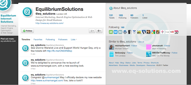
Equilibrium Solutions is a nice example of using the left-side background for their company information and they also have a large logo behind the right-side content.
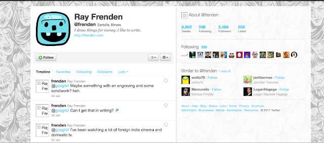
Ray Frenden is using a consistent, repeating background that looks nice and clean while showing personality and style.
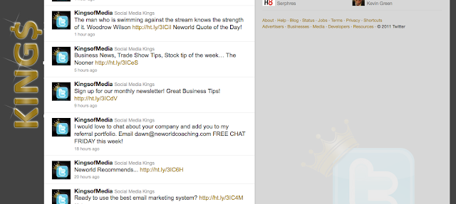
Social Media Kings also has their company name of the left-side and has an large image of their logo behind the right-side content.
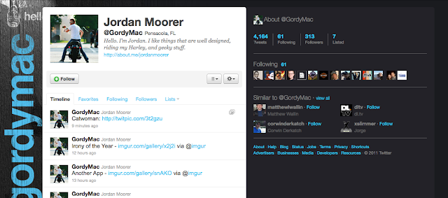
Jordan Moorer is also utilizing the left-side background nicely.
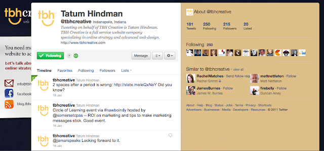
Did you know? Twitter has a new view (which will eventually become the only view). TBH Creative’s current Twitter design was created for the old Twitter view which was more narrow. In the new Twitter view, the content takes up more room (about double the size), allowing less room for an effective background.
As noted above, the right side of the content area is transparent in the new Twitter view versus solid in the old view. This gives a lot more to think about when creating your background design.
TBH Creative can help determine the best social networks to increase your social profile. Social media is important for your business for many reasons — to increase your visibility, stay in communication with your clients or target audience, increase your search engine optimization and more. Learn more about our social media services and talk to us about your social networking plan.
Need help with Twitter design? We would love to help along with Facebook, blogging, and email marketing.