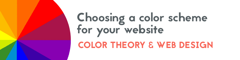
In this article, we’ll take a look at the various types of color schemes that you can use for your website or brand, as well as tools and resources to help you choose a color palette.
Monochromatic
A monochromatic color scheme is simply made up of a single color, with different tints and shades used to created a full color palette. This is a great way to ensure that all of your colors will work well together and appear balanced, since they are all derived from the same hue. A monochromatic color palette can be helpful in highlighting a primary brand color while still offering a variety of colors to choose from to make your design more interesting.

Complementary
A complementary color scheme consists of colors that are opposite each other on the color wheel. This creates a color palette with high contrast, which can be beneficial on a website in order to draw attention to certain content areas with a contrasting accent color. Using complementary colors will help to create harmony in your design.

Compound (or split complementary)
A compound color scheme is created when you choose a color and the two colors adjacent to its complementary color. While similar to a complementary color scheme, the addition of adjacent colors helps to create a more interesting color palette but with less contrast.
Triadic
Triadic color schemes consist of colors that are evenly spaced on the color wheel. This helps to build a more varied color palette while still appearing balanced. A triadic color scheme is a great choice for building up a selection of accent colors to use on your website for elements like calls-to-action or other buttons.
Analogous
An analogous color scheme is created when you choose colors that are next to each other on the color wheel. It is similar to a monochromatic color scheme, but with a larger range of colors. However, it generally results in a low-contrast color palette, and may benefit from choosing an additional accent color when used for a website.
Websites with effective color palettes
Aircom Manufacturing
The Aircom website uses a monochromatic color scheme, with various tints and shades of yellow.

Swink

Strategic Materials
The Strategic Materials website has a color palette based on a triadic color scheme.

Natuur & Milieu
On the Natuur & Milieu website, the color palette is built around an analogous color scheme, with colors range from blue to green.

Imaging Office
The color palette for the Imaging Office Systems website is made up of two sets of complementary colors: red and green with blue and orange.