Looking for newer examples of medical website design trends? Get inspiration from our latest blog posts covering healthcare web design and good hospital websites.
What makes for a good hospital website design?
It takes a combination of design elements, usability, and content. Each of these elements contribute to how effectively a healthcare website serves the needs of its users.
Many hospital websites fall short in this area, especially when it comes to providing a modern, clean design. This showcase takes a look at the hospitals that stand out among their peers, whether it’s from a more modern web design or enhanced usability.
Read on to see examples of a wide range of healthcare site homepages and learn what makes each one so successful.
Scripps
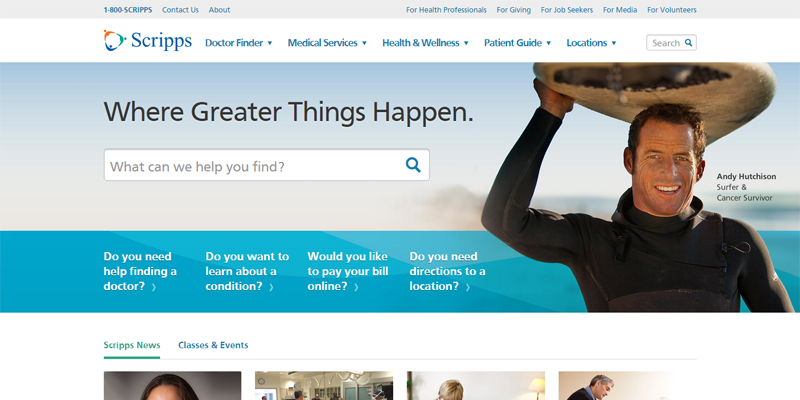
What the Scripps homepage does well: The Scripps website has an open, clean design that feels inviting and calming. The banners at the top of the page use photos of real patients, which helps to make a connection with users.
The guided navigation is helpful for patients, with directed questions to get users to common places on the site (e.g., “Do you need help finding a doctor?”). Their healthcare homepage also highlights news and events to support engagement.
Lakeland Regional Medical Center
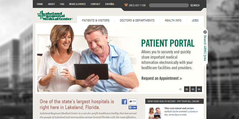
What the LRMC homepage does well: Lakeland promotes a modern design that is easy to navigate, with links to the four main content sections above the content. The large photo background helps to add interest to the design without distracting from the content.
The rotating area on the homepage provides calls to action for highlighted information. The phone number is displayed prominently in the header so users can easily contact the hospital. The search bar is prominent as well, helping users to easily find the information they need.
Pullman Regional Hospital
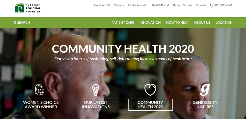
What this homepage does well: This website has a modern design that focuses around high-quality imagery, including a looping video on the homepage. It’s very patient-centered, promoting real patient stories and community involvement. The hero area on the homepage calls out the hospital’s achievements and innovations, building credibility and trust.
Alaska Regional
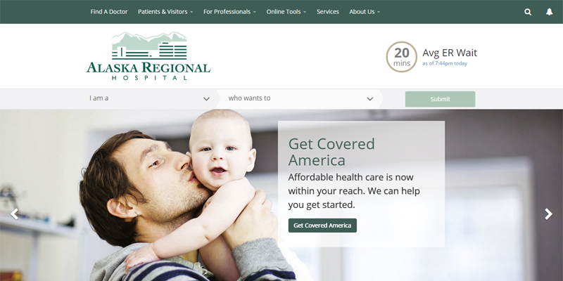
What this homepage does well: This website makes it very easy for users to navigate to the information they need. There is a guided search feature at the top asking who you are and what you’re looking for to help you get to the right place. It features an ER wait time, which is a helpful feature for visitors. There are quick links to the different areas of the site in a carousel format, helping you easily find what you need.
Chase County Community Hospital
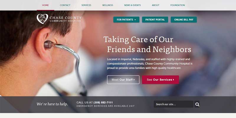
What this homepage does well: The Chase County site has a large hero section on its homepage, with high quality photography and prominent calls to action. It includes buttons to common patient information right at the top of the page, which is helpful. It highlights the search bar so users can quickly find what they need, and highlights its phone number as well for quick contact. The homepage also includes news and events for the hospital to engage visitors.
Lake Regional Health System
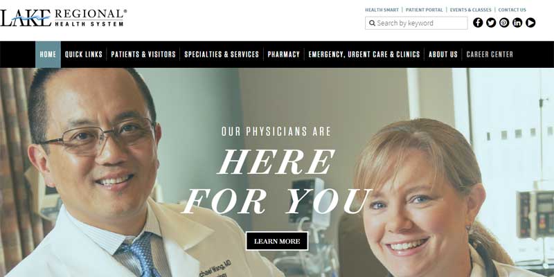
What this homepage does well: The large photo banner on the homepage uses real physician photos, making it appear friendly and welcoming. The site is easy to navigate, with a clear and well-organized menu. This homepage is patient-centered as well, with calls to action for patient stories and a patient portal. It promotes user engagement and builds credibility by highlighting its blog, newsletter, and magazine.