Even though Flexbox is currently in the W3C candidate recommendation stage (meaning it is yet to be finalized and has limited browser support), it’s still important to understand what all it can do. This article provides an introduction to Flexbox, including its main features and how it can be used.
Flexbox overview
Flexbox takes CSS layout to the next level, providing more advanced control over the elements in a website layout. As its name implies, the key feature of Flexbox is indeed flexibility. It provides an easier way for elements to adapt to their containing element, allowing the alignment, wrapping, and order of elements to be quickly adjusted.Flexbox eliminates the need to use floats and other display properties in order to arrange elements on a page. It introduces a new set of CSS properties that can be used to control layout. These new properties can be enabled simply by adding display: flex to an element.
Let’s take a look at some examples of the most useful Flexbox properties.
Alignment: Flexbox can be used to quickly align elements with it’s justify-content property. The example below shows how the same navigation links can be aligned in multiple ways. Perfectly centering content can sometimes be challenging using CSS, but Flexbox makes it as simple as changing a property value.
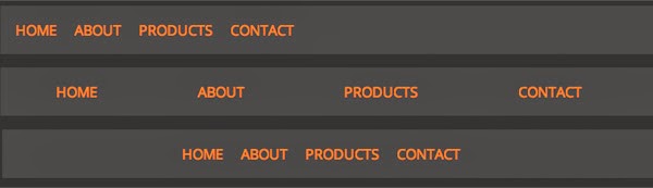
Various alignment options using the “justify-content” property.
Direction: The flex-direction property provides advanced control over the direction of elements. It can be used to arrange elements into rows or columns, or to reverse the order of elements within a container.
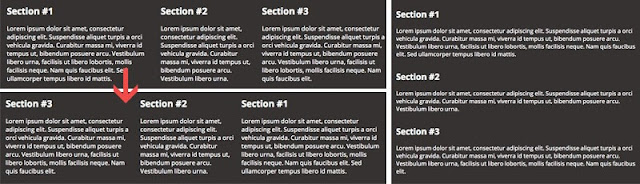
Sections can easily be reversed or changed to rows or columns using the “flex-direction” property.
Order: Flexbox allows the elements on a website to be re-ordered without altering the website’s HTML, which is one of its most attractive features. This can be done using the order property. The higher the number of the order property, the lower on the page an element appears. In the example below, the navigation starts off at the top of the page. By changing the order property of the navigation, it moves below the content. This is especially useful for responsive websites, so elements can be easily shifted in order of importance.
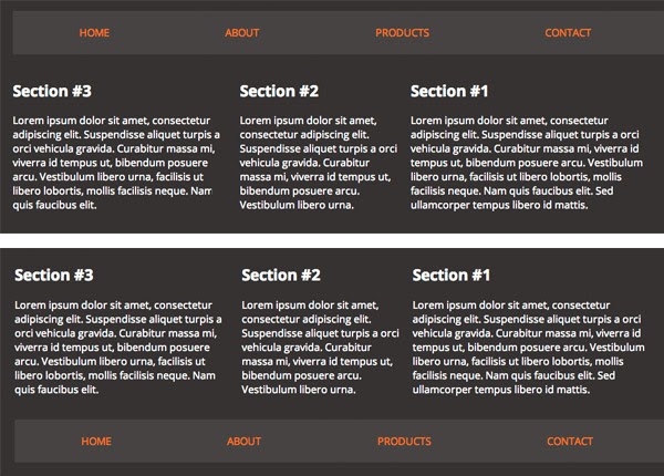
The sections on this page have been re-ordered using the Flexbox “order” property.
This is just a brief overview of what you can accomplish with Flexbox. To dive deeper into Flexbox properties, check out the Complete Guide to Flexbox.
Browser support
Browser support for Flexbox is growing, but not all browsers support it just yet. Furthermore, some browsers support Flexbox, but use an older version of its syntax. Check out the Flexbox browser support chart at CanIUse.com to find out more.The future of Flexbox
Flexbox brings some much needed improvements to CSS layout. With browser support increasing, it can soon be widely utilized, so it’s important to understand how powerful it can be. Creating flexible, responsive websites will be easier than ever with the advanced control that Flexbox provides.
Need help improving the layout of your website? TBH Creative would love to help! Contact us to get started.
