Zurb.com uses a grid-based design to achieve a balanced, well-structured appearance.
With so many grid systems available, it can be hard to choose between them all. The first step in making that decision is to know what aspects of the grid you need to take into consideration. Not all grid systems are created equal, and you want to make sure you are choosing one that is best suited to the needs of your website.
Here are some of the most important factors in deciding what type of grid system to use:
Fixed vs. fluid/responsive
Probably the most important question you need to ask before deciding on a grid system is whether or not your site is going to be responsive. If so, you’ll need to rule out any grid systems that have a fixed base width. For example, the 960 Grid System is based on a fixed width of 960 pixels with no fluid column options, and thus wouldn’t make a good choice for a responsive design. Some grid systems allow for both instances, as is this case with Bootstrap’s grid. The CSS classes you use determine whether or not the columns will be responsive.
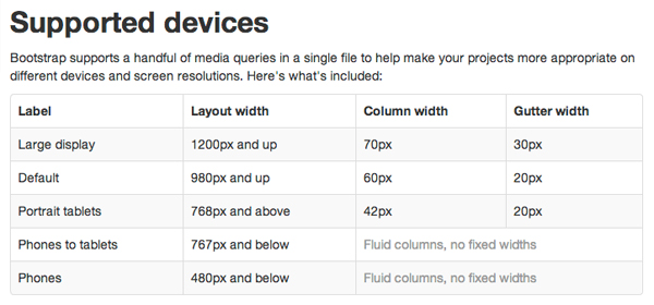
Bootstrap’s grid system adjusts it’s column and gutter widths for different devices
Columns and gutters
Once you’ve determined what type of grid system you want, the next thing to consider is structure. As mentioned earlier, each grid has a base width. If you want your site to be a specific width, you’ll need to choose an appropriate grid to accommodate that design choice. Gutters are also an important structural feature that should be given attention. Gutters are the space between columns, and each grid system treats gutters differently. The size of gutters can vary, and some grids don’t include gutters at all. They could be measured in pixels, ems, or percentages. There’s no particular standard for gutters, so make sure to think about your site’s design to determine what would work best.
Browser compatibility
Browser compatibility is a crucial factor in choosing a grid system. If your website needs to support older browsers, such as Internet Explorer 7, make sure the CSS code being used is compatible. Some grid systems use properties like “last-child” or use fixes for clearing floats that may not function properly in older browsers, thus breaking the layout. If you need to support a specific browser, take a look at the documentation for your desired grid system to ensure that it fits any special criteria.
SASS/LESS compatibility
If you are using a CSS preprocessor like SASS or LESS, consider choosing a grid system that comes with code specifically tailored towards that. There’s no need to re-invent the wheel and try to fit a grid system into your desired format when it may already exist.
So which one should I choose?
Using a grid system is the important part; which grid system you choose essentially boils down to personal preference and project requirements. You may even decide to build your own, or modify one that already exists. For example, the website Gridpak allows you to create your own grid and then download the files you’ll need.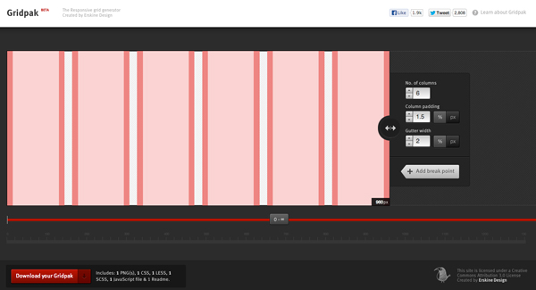
Gridpak lets you easily create your own grid system.
To help get you started in choosing a grid system, here is a list of some of the most popular options:
- Bootstrap
- Responsive Grid System
- Profound Grid
- 960 Grid System
- 1200px Grid System
In need of a new design for your website? Get in touch, and let us show you how a grid system can work for you.
TBH Creative is an Indianapolis-based website design and development company. Our offices are located in Carmel, Indiana. We help our clients design, build, and promote websites. Learn more about TBH Creative.
