In this first installment of our two-part series, “Color Theory & Web Design”, we’ll take a look at the core principles of color theory and how they can impact your website.
The color wheel
The color wheel is a tool that shows the relationship of colors and can help you to choose colors that look good together. This is a useful tool in web design, as it can help you to choose color combinations for your website that are appropriately balanced and appealing to users.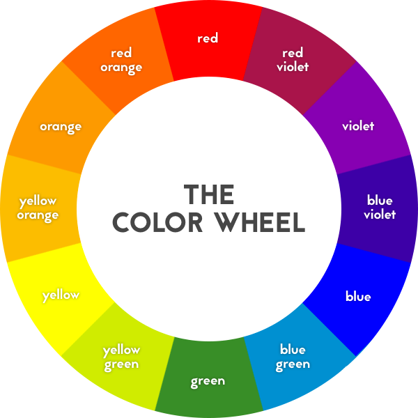
There are three types of colors on the color wheel:
Primary colors
These are also refereed to as “pure” colors, and can’t be achieved by mixing other colors together. These are red, yellow, and blue.Secondary colors
Colors that can be achieved by mixing together two primary colors. These are green, orange, and purple.Tertiary colors
A result of mixing a primary color with its adjacent secondary color. These are yellow-green, blue-green, blue-violet, red-violet, red-orange, and yellow-orange.
As an example, TBH Creative’s main brand color is a tertiary color—a yellow hue with a tint of orange (yellow-orange). Less prominent accent colors of our brand are teal green, dark blue, and gray.
Some other brands that use yellow or orange for their brand are Amazon, Etsy, Blogger, ShutterFly, Best Buy, McDonalds, Subway, and Yellow Pages.
Color characteristics
In addition to where a color falls on the color wheel, there are a variety of characteristics that make a color unique and impact the emotion it elicits. The three major characteristics of color are hue, value, and saturation.Hue
Hue is essentially interchangeable with the word “color”, and refers to any color on the color wheel. The hue we perceive is dependent on the wavelength of light being reflected.
Value
Value is the lightness or darkness or a color, which can be separated into tints and shades. A tint is created by adding white to a color to make it lighter, while a shade is created by adding black to a color to make it darker.
Changing the value of colors can help to create contrast. The further away in value two colors are, the more they will contrast.
By using contrast on your website, you can help users to better focus on specific elements. A good example of this is the contrast between background color and text color. If there is a lack of contrast between the text color and the background, users might strain to focus on the text, making it unreadable. Generally, it’s best practice to have a dark text color over a light background color. Contrast can also be used to set important elements apart from the rest of the page, such as a call to action.
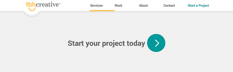
TBH Creative’s uses a teal green color for calls-to-action and buttons as a nice contrast to the primary brand color of yellow.
Saturation
Saturation refers to the intensity or luminosity of a color. A saturated color will appear more vibrant and bright, while a desaturated color will appear dull.
Saturation can impact the emotional response generated by a color, which can be used strategically on a website. For example:
- Brighter colors tend to lead a viewer to feel more energetic, which can be helpful when trying to sell a product.
- Desaturated colors on the other hand may lead users to feel more relaxed, and allow them to better focus on content.