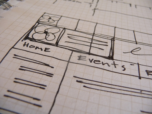
The well-known adage “a picture is worth a thousand words” means a lot when it comes to planning a website. In his book Sketching User Experience, UX guru Bill Buxton wrote that sketching “does not represent a refined proposal, but rather simply suggests a tentative concept.” It’s the freedom, energy, and minimal detail of simple sketches that invites the flow of suggestions and refinements that lead to stronger, more refined concepts and ideas.
Sketches are an inexpensive and timely tool that help everyone involved with the creation of a new website (or those participating in a website redesign) to visually understand how users will interact with content. While words can help explain functionality, sketches that show everything from the location of navigation and placement of buttons takes concepts to the next level by adding concrete complexity.

“I’m not an artist! I can’t sketch.”
When it comes to website designs, anyone can communicate their ideas with sketches. Sketching is not just for artists. Low fidelity sketches help everyone communicate and think about their ideas quickly and easily. If you can draw simple symbols, you can communicate complex visual ideas that will help plan your website’s user experience and layout. Sketches are useful when it comes to sowing potential interface structures, basic shapes, and a website’s visual language, making them a great place to start your project.
“Hand-drawn vs. computer sketches—Where should I start?”
Though you can sketch ideas on the computer, ultimately the hand is mightier than the mouse. Sketching with a pencil and paper makes it fast to generate multitudes of concepts and refine ideas down to a final solution. Hand-drawn sketches do what words cannot by showing ideas and functionality drawn out step by step. When sketching only on the computer, it’s far too easy to draw the wrong thing or limit your sketch to what you’re able to do with the tools of the application you’re using.
After the first round of sketching is discussed is often a good time to start refining sketches on the computer and developing wireframes and comps with more detail (or HTML prototypes). These high-fidelity digital sketches might include the final grid and navigation ideas as well as key user interactions such as indications of clickable items, linked text, and tappable regions.
As your project gets more defined during the initial brainstorming and sketching session, you can use follow-up sketches to communicate more detail and integrate deliberate words and labeling that will add clarification and keep the design process moving forward.
Are you making plans for your website? TBH Creative specializes in website strategy and web redesign for organizations and businesses. We’ll help you sketch your way to a successful website solution.
