Throughout the next few weeks, TBH Creative is going to be running a series of blog posts highlighting our favorite websites of 2012, identified by industry. Each post will also include a list of important must haves elements for websites within each industry.
Last week we examined sports medicine websites. This week, we’re focusing on educational websites. We chose these three websites for their exemplary layout and organization, color schemes, and content.
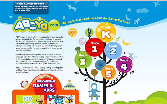
ABCya.com
ABCYa.com’s website focuses on learning games and activities for young children. The layout uses engaging graphics and bright colors to add energy and pep to the navigation. Though the design of the website is playful, it’s still highly organized, making the wide variety of games and activities easy to find when browsing.
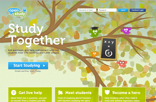
OpenStudy
OpenStudy’s website helps older children with their learning needs. The graphics are used strategically and do not detract. Through the website, students can start studying, get live help, meet students, or become a “hero.” Because the design is clean and the site structure is logical, it doesn’t take users long to find what they need.
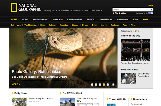
National Geographic
National Geographic’s website appeals to child and adult learners alike. Using its branded, simple yellow and black color palette, the National Geographic builds on the reputation of the print magazine and TV programming. The website presents a lot of information in a thoughtfully organized manner and the search functions accurately and pulls up useful results for even the strangest queries.
Top 5 Must Haves for Educational Websites
- Keep content well-organized: Most educational websites offer a lot of information. Make sure this information is well-organized and incorporate a search function for those who don’t want to browse.
- Easy to understand navigation: The navigation bar is where most users will go to find the information they need. Use clear labels and organize content in a logical, easy to understand structure.
- Incorporate imagery: As they say, a picture is worth a thousand words. High resolution images are a great addition when helping communicate information. Liven up page after page of text with related imagery to keep users interested—and, learning!
- Add news updates: Keep your content fresh by incorporating related news stories.
- Allow users to engage with each other: Build a community for your users. Listing events, interest groups, and more are great ways to connect users with similar interests together.
TBH Creative example
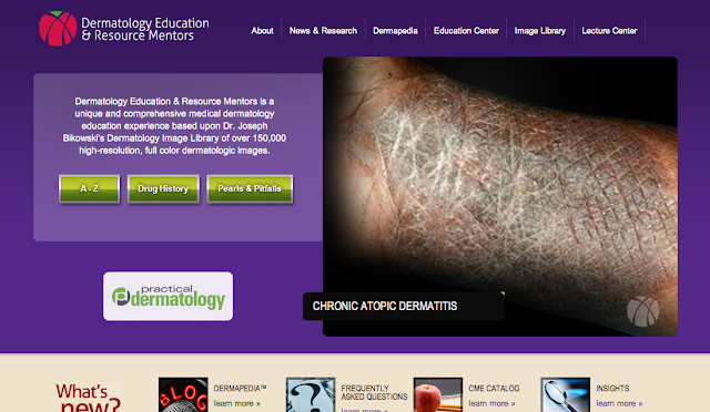
Dermatology Education & Resource Mentors Website by TBH Creative
Does your education website need a facelift? TBH Creative is a web development company located in Indianapolis, Indiana. Specializing in online strategy, web design, social media, and search engine optimization: let us help you with your company’s Internet needs.