Typesetting plays an important role in all designs. Your fonts are a part of your branding and they communicate your company’s goals and mission. What fonts you choose and how you handle them communicates volumes.
Web type guidelines
Use relative fonts
Having relative fonts on your website is most important rule for using type online. When a website uses relative fonts, the type will change accordingly if the user zooms in, enlarges the text, or has a preference size set for their browser. There are certain ways to make your font adjustable. The preferred way to change the font size is in the CSS. Don’t use a <font> tag and change it in the HTML (as mentioned on W3C’s website). CSS is not only a lot easier, but it also saves bandwidth which means better speed and performance for users.
Avoid putting text in graphics
Using graphics for text also influences zooming. When your type is pixelated as part of a graphic, the user has no ability to adjust it. When text is set in graphics, the words take up more bandwidth and slow page load times.
Don’t set your type too small
Setting your type in 12- or 14-points is a good starting point for body copy. The only time when type set at a smaller point size is appropriate is for footers and other discretionary text blocks. PXtoEM has set up a calculator that can help switch from points or pixels to em.
Here are some before and after examples of how type looks at different zooming ranges.
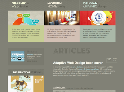
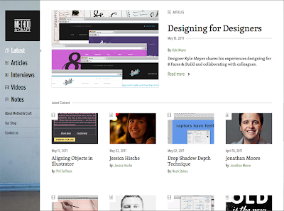
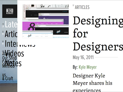
The structure of this website is organized clearly,
but the body text could be a little bigger to add clarity.
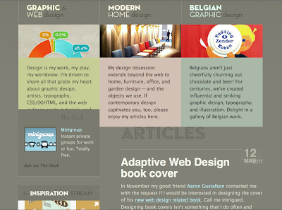
Most of the fonts are relative. The top 3 sections of text
are graphics along with the word “Articles.” Though these are graphics, they are typeset
large enough so that you can still read them.
Big Top
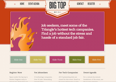
The fonts are typeset at an aesthetically pleasing, easy-to-read large size.
This is a great example of a nicely sized base font.
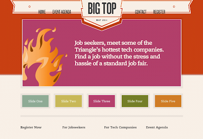
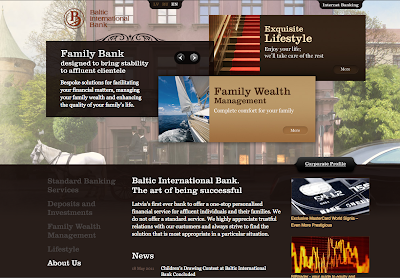
The only text on this example is the navigation, but it isn’t relative.
The four sections at the bottom of the site are images. The font size remained
the same when I zoomed in, the only thing that changed was the space around the text.
This site is a good example of thoughtfully sized body copy and headers.
Though the layout got a little jumbled when I zoomed in, all of the text on their website is relative.
The only text that isn’t is their graphic for their logo, which is normal and acceptable.
This website has a great base font size, but the type
in their navigation is hard to read.
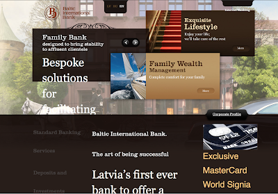
Most of their type is relative. Their navigation and “more” buttons remained the same size.
Make sure that your viewers can read what you’re all about. Use relative font size to ensure your viewers’ preferences change your websites font. TBH Creative can help you determine whether your website has relative fonts by conducting a free website consultation. If the answer is no, we can improve your website with a redesign.
Contact TBH Creative web design in Indianapolis today.
