Images are powerful tools for your website. They help tell stories, elicit emotion from your audience, and increase conversions. It would be difficult to create an effective website without images.
However, using images requires a balance between the size of your images and website performance. The purpose of imagery on a website should be to enhance your content and improve the user experience. If images are negatively impacting the performance of your website, they begin to do the opposite.
However, using images requires a balance between the size of your images and website performance. The purpose of imagery on a website should be to enhance your content and improve the user experience. If images are negatively impacting the performance of your website, they begin to do the opposite.
Consider this: according to the HTTP Archive, over half of the data loaded on the average website page is dedicated to images alone. That’s a lot of data! If those images aren’t optimized properly, it results in even larger file sizes that take up valuable loading time for your users.
Optimizing images is one of the quickest ways to improve website speed. Incorporate simple techniques throughout your workflow, from planning to development, to improve the way you’re using images.
Get started with image optimization on your website by asking yourself the following questions.
Are you choosing the right file types?
When working with images on the web, it’s important to understand the options available to you and which file type is the right one for the job. The average image requests for websites are 45% JPG, 28% PNG, and 23% GIF, making it obvious that these are the most popular file types (HTTP Archive). But, did you know there are other options?For example, SVG is a popular choice for using vector images online since it’s resolution independent and typically smaller in size. Furthermore, an SVG file can be used inline and easily manipulated with CSS.
There’s also WebP, a newer file type from Google that has been gaining popularity in recent years. It functions as a smaller alternative to both PNG and JPG files. Learn more about it on the Google Developers site.
When choosing a file type, consider what your image consists of and its purpose. Choose the image format that will result in the smallest file size while retaining quality. For more information on which file type to choose for your images, check out the following resources:
Pro tip: When saving out images, choose a file type that will result in the smallest file size while retaining quality.
Are you using the appropriate dimensions?
In addition to file type, dimensions also affect the size of your images. A good way to determine the right size for your images is to identify where they will be used on your website and make them no larger than needed for that space.For example, if you are creating images to be used in a content area that is 800 pixels wide, then your images don’t need to be larger than 800 pixels wide. Making images bigger than needed results in unnecessarily large files that can slow down your page, since the full image will be loaded whether or not it’s being displayed at that size.
However, sometimes using larger images is necessary. An image sized down to its container size may look blurry on certain devices that will display your website at a higher resolution, such as those with Retina display. In these cases you should determine where quality is more important than speed and if it warrants upsizing your images to account for users of these devices.
Are you compressing your images?
Once you have the right file type and dimensions for your image, you can take optimization a step further by compressing your images. Typically, just saving an image from a graphics program doesn’t cut it when it comes to compression. Use one of the many tools available to optimize your images even further to get the smallest file size possible.If you’re using Photoshop to create or edit your images, start by using the “Save for Web” option when exporting files. If you’re using Sketch, consider downloading a plugin for increased optimization. You can also use an external tool to get the job done, such as:
No matter which tool you choose, the important part is to incorporate it into your image workflow and be consistent with compressing your images before adding them to your website.
Pro tip: Always compress your images before adding to your website.
Can the design of your images be adjusted to improve size?
Image optimization starts in the planning and design phases. If you know you will be including a large number of images in the design of your website, consider different approaches to image treatment that could help reduce file sizes.Essentially, the more detail an image has, the larger the file size will be. This means that adding effects such as gradient maps, black and white, overlays, and so on can reduce the file size of an image. Using this consistently across your website as part of your style guidelines can be an effective way to minimize loading time.
For example, take a look at the following images:
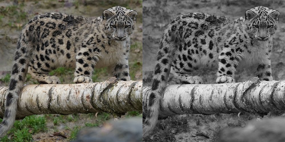
The full color version on the left was compressed down to 94.5KB. The black and white version on the right was compressed down to 83.7KB. The more images you have on your website, the more that difference can add up!
How are you handling responsive images?
It’s important to consider your mobile users specifically when discussing image size. Downloading images takes up data, so reducing the amount that mobile users are loading is crucial.For vector-based images, using SVG is a great way to adjust images to any screen size without worrying about large file sizes since they are resolution independent. For backgrounds or other images generated through CSS, consider using media queries to serve smaller images to mobile devices.
For inline images, consider using techniques such as the srcset attribute or the picture element. The srcset attribute can be used on the img element to define a set of images at different sizes, allowing the browser to choose the best option depending on device characteristics such as device width. The picture element is best used for when different images should be displayed depending on the display size of the device.
All of these options offer ways to display the best optimized image to users depending on how they are viewing your website. To learn more about responsive images and using srcset or the picture element, check out the following resources:
Pro tip: Pay special attention to mobile users when determining the best way to optimize images on your website.
Should you implement advanced loading techniques?
There are also more advanced options to consider to further decrease image loading times. If you have a particularly image-heavy website, here are some popular techniques that can help to improve performance:Lazy loading. Lazy loading consists of loading images only when needed, helping to reduce loading times for users. One of the most well-known examples of lazy loading images is Pinterest. As the user scrolls down the page, more images are loaded onto the screen. There are a variety of techniques and plugins for implementing lazy loading, so consider the needs of your users in order to select the best option.
“Blur-up” technique. This involves displaying blurred versions of images for quick page loading, and then replacing the images with the full version once ready. Check out these tutorials for more information:
- The “Blur Up” Technique for Loading Background Images
- How to Build Your Own Progressive Image Loader
Where can you learn more?
For in-depth information on optimizing images, check out the Essential Image Optimization eBook.For more tips on using images on your website, check out these articles:
- Images and your website: Tips for choosing effective imagery
- Benefits of using SVG (Scalable Vector Graphics)
- Image is everything: Put YOUR stock to work for YOU
