
Amidst the multitude of browsers, devices, and operating systems out there – how do you choose which ones your website will support? This may seem like a simple decision on the surface, but the more technologies you decide to support, the more time and effort you’ll need to put into optimization. In this article, we’ll provide tips on how to analyze your options and choose the right support strategy for your website.
The basics of technology support
Just because you code your website in adherence with the latest standards and technologies doesn’t mean it will work everywhere. In fact, it can mean the exact opposite, as new coding techniques oftentimes aren’t supported by older technology, and may not be widely supported by new technology either. To further complicate things, there are a variety of inconsistencies between browsers and devices, and each comes with its own set of quirks and capabilities. All of this can lead to challenges for web developers and confusion for clients.But what does this mean from a user perspective? Let’s say a user is browsing your website using an older browser and the page they are on relies on modern CSS techniques to style the content. That particular user might not see the same styles as someone using a modern browser. In the worst case scenario, core functionality on a page might break entirely, making the website unusable.

Differences between browsers could be as subtle as seeing rounded corners in one version and not in another, such as with older versions of Internet Explorer than don’t support the border radius style property.
This is why browser and device testing is crucial to the web development process, and defining technology support for your website helps to set the limits on what that entails. Making your website “work” on older technologies can take time and effort for testing and implementing fixes, so it’s important to make informed, strategic decisions about what technology to support. The general goal should be to provide a good user experience to as many of your users as possible while staying within project limitations.
However, keep in mind that just because you don’t explicitly support a specific technology doesn’t mean your website will look bad for visitors using it. There are steps you can take to minimize issues on untested technologies, such as implementing a fully responsive website. While they have their differences, modern browsers and devices typically provide a similar browsing experience, requiring less optimization effort.
Developing a support strategy requires a basic understanding of the technology that’s out there. Essentially, you need to determine a support level for the following categories:
- Browser. The browser used to access your website varies from user to user. Popular modern browsers include Chrome, Firefox, Internet Explorer, Safari, and Opera. However, there are many different versions of each of these browsers as they have updated over the years. While many browsers now auto-update for users, there are still instances where users have access to old versions that might not support modern coding techniques. This is a common issue with Internet Explorer, where older versions are still available and can be challenging to work with.
- Device/operating system. There are a plethora of smartphone and tablet devices available to users, as well as a variety of operating systems (OS). The most common operating systems out there today are iOS (Apple), Android, and Windows. However, users can be accessing your website from any number of mobile browsers available for download on the devices, each with their own features and capabilities.
- Screen size/resolution. Screen sizes vary widely across devices, from smartphones to tablets to TVs. There are multiples resolutions to take into consideration as well, such as with Apple’s Retina Display. One of the best ways to ensure your device looks good on all screen sizes is to implement a responsive design, although sometimes advanced functionality is needed to optimize the user experience at specific sizes.

Designing your website to be mobile-friendly helps to make sure your website adapts to a variety of devices without having to test on each one. For example, the Kermans Flooring website was built responsively to adapt to any screen size instead to specific devices.
How to choose a support strategy for your website
There are typically three main options on how to approach support for older technology:- Ignore older technology completely and only code for modern browsers and devices
- Don’t use modern techniques that won’t work on older technology
- Code for the latest technology but implement fixes as needed for older technology
Use analytics to determine support requirements based on data
If you use a service like Google Analytics on your website, you see what technology your audience is using to access your site. For example, Google Analytics provides data on what browser, device, and operating system a visitor uses. Use this data to see what technologies are most popular and therefore should definitely be supported, as well as what technologies get little to no use and can be a lower priority. You don’t necessarily need to spend countless hours optimizing your website for older browsers that only have a small percentage of usage.Determine any project restrictions
Unfortunately, project restrictions can be a factor towards what you can and can’t support, regardless of the data. Fixing broken functionality for older browsers and operating systems can be time consuming and isn’t always possible with budget or time constraints on a project. When this is the case, it’s best to start by supporting modern technology, and then determine how far back you can go.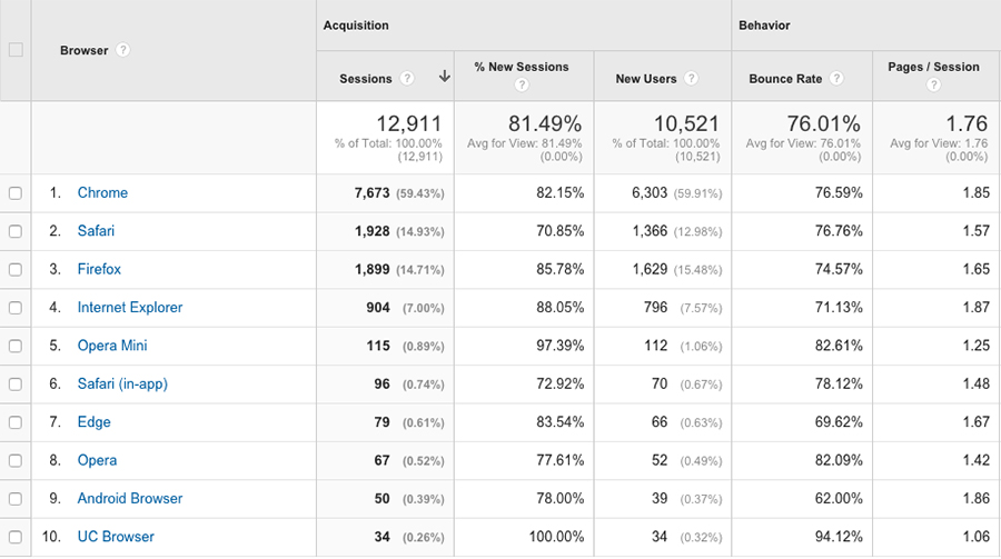
Google Analytics provides a variety of information about what browsers and devices your audience is using to view your website, including what percentage of your audience is using a particular browser.
Define acceptable downgrades
Your website doesn’t necessarily need to look and function the same on every browser and device. If you aren’t able to fully optimize your website for a technology that doesn’t support some of the features on your website, you can plan for an acceptable downgrade in those cases. Start by determining what features are absolutely necessary for your website to function and must work on all technologies. Then, determine what features are okay to adjust when needed, such as with unsupported coding techniques, and determine the appropriate fallbacks.Let your testing capabilities help drive your decision. It’s best to not plan to support a browser or a device that you have no access to, as you won’t be able to conduct proper testing to ensure support. For example, if you say your website supports an old version of iOS but you don’t have access to a device that runs it, you have no way to confirm whether or not that’s true.
Minimum support recommendations
The above steps should help you narrow down what technology your particular website should support, but there are some general guidelines you can follow as well. At the very minimum, it’s safe to assume your website should be compatible with the following:- Browser: Support the latest two versions of all major browsers, including Chrome, Safari, Internet Explorer, Firefox and Opera. These browsers can differ between devices, so make sure you are testing them on different platforms, such as on a Mac and a PC.
- Device/OS: Support the latest two versions of all major mobile operating systems, including iOS, Android, and Windows.
- Screen size/resolution: Optimize for general mobile and tablet screen sizes, as well as on larger screen sizes such as a TV display. Make sure you website displays properly on devices with higher screen resolutions.

Recommended testing environment
Saying you support a certain technology is one thing, but it’s necessary to actually test your website on supported browsers and devices to make sure everything is working properly. In order to do so, you need to set-up a testing environment accordingly. A basic testing environment should consist of all major browsers on both Mac and PC, mobile devices with access to each of the main operating systems, and a variety of screen sizes.It can be challenging and costly to put together an adequate variety of devices, but if you aren’t able to gain access to certain technology, there are some tools that can help. Services like BrowserStack or Sauce Labs provide access to an assortment of browsers and devices that you might not have readily available. Software like VirtualBox or VMWare can be used on any computer to simulate additional operating systems and browsers. It’s generally best to test on an actual device when possible, but these tools can be useful when that’s not possible.
For more information on putting together devices for testing, check out this article: Prioritizing Devices: Testing And Responsive Web Design
Need help improving device and browser compatibility for your website?
Contact TBH Creative and find out how we can help 