 |
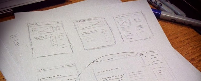
| Website planning sketches (Photo by Garrett Coakley, CC BY-NC-SA 2.0) |
Many websites have three levels:
- Home page
- All pages linked off the main menu
- Pages that are linked off main menu items
On the first two levels it is important that you keep content short and direct with clear calls to action. Check out our post about the importance of calls to action. The main purpose of these pages is to introduce yourself and draw people deeper into the site. Once someone clicks through to the third level (or deeper on large sites) you can introduce more content. At this stage the reader has proven an interest in what you have to say and if you force them to click much deeper for information they will be frustrated.
At all levels, you should carefully consider what and how you want to say it. Set goals for each page—goals in the main points to communicate and goals in what you want your audience to do after reading the page. Make this part of your planning and your website will be more successful.
How does responsive design affect web content?
Responsive design—a design that scales and works on any device whether a laptop, tablet or phone—is most likely driven by a desire for your site to work well and present itself cleanly on any size screen. Of course the design and layout are important in that process but so is content!
As a design scales the content on the page is likely to shift—say move from three columns wide to two or even one column. Sidebars often drop to the bottom of the page. And sometimes, content drops off the page entirely in an effort to make the page more manageable on a small screen. Now, you can’t write separate content for a responsive design since it’s using the same content by its nature. However, you can keep this scale-able movement in mind when writing content.
Perhaps the most important thing you can do with content is create content categories and work with your design team to decide what happens to each category as the page shifts in size. Then, instead of an important call to action in the sidebar always dropping to the bottom of a page—you can have it display further up the page as the design narrows causing the sidebar to drop.
A great article about responsive design and content:
The take-away from this article? Give your content the same planning and forethought that you give to the rest of your site and you’ll have a website that reaches your audience no matter how they are accessing your site.As a design scales the content on the page is likely to shift—say move from three columns wide to two or even one column. Sidebars often drop to the bottom of the page. And sometimes, content drops off the page entirely in an effort to make the page more manageable on a small screen. Now, you can’t write separate content for a responsive design since it’s using the same content by its nature. However, you can keep this scale-able movement in mind when writing content.
Perhaps the most important thing you can do with content is create content categories and work with your design team to decide what happens to each category as the page shifts in size. Then, instead of an important call to action in the sidebar always dropping to the bottom of a page—you can have it display further up the page as the design narrows causing the sidebar to drop.
A great article about responsive design and content:
Need help developing a content strategy? Ready to talk about responsive design?
The TBH Creative team is ready to help.
The TBH Creative team is ready to help.
