The fact of the matter is that a website not designed to be viewed on a mobile device is hard to read, hard to use and, in many cases, will turn away your audience. And your audience is, indeed, moving to mobile devices. According to a study done by Pingdom, 8% of all web traffic in the United States came from a mobile device in 2012. That’s a number that’s rising each month. In fact, Microsoft predicts that mobile Internet use will overtake desktop Internet use by 2014.
Still not convinced?
More statistics from Google that illustrate the importance of presenting your organization in a mobile-friendly fashion:
• 60% of people expect a mobile site to load in 3 secs or less
• 40% of people have turned to another website because of a bad mobile experience
• 61% of users call a business after searching and 59% visit the location
• 90% of these people act within 24 hours
• 81% of users prefer mobile sites to apps for researching prices
The question isn’t if you should incorporate a mobile design into your web presence. The question is when.
When is it time to invest in mobile design?
There’s no denying that overall trends are pointing to increased use of mobile devices to access websites. But how does that impact the website for your organization based in Indianapolis, Indiana? It’s time to watch traffic reports. If you’re not already monitoring page views and visits from a mobile device, you should be. (And if you don’t know how or where to access that usage statistic, ask us and we’ll help.) We recommend that when your mobile traffic accounts for 20% of your overall traffic, it’s time to make the move to a mobile design. If your mobile traffic is more than 10%, we recommend that you start planning for a mobile design so that you can stay ahead of the trend.How do you incorporate a mobile design into your web presence?
Developing a mobile-friendly website can give you a competitive advantage – and that’s where TBH Creative can help. You don’t need to change your brand, your colors or your style. You do need a design that is built to work in a mobile format. You need a design that uses Responsive Web Design (RWD) and Scalable Vector Graphics (SVG) – technologies which recognize the type of device a reader is using and adjusts the site specs to fit it. And if you haven’t updated your web design in a while, now is the time to consider it. Your website should be based on HTML5 – the most current version of markup language that supports the latest in multimedia technology. Incorporating these technologies in your primary website and mobile site are steps you’ll need to take to ensure that your audience is still able to get the most out of your online presence.Tech terms aside – you need a design that is easy for your users to see on their smart phone or tablet.
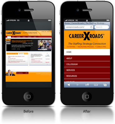
Here’s an example from a recent TBH Creative project. Before investing in a mobile design, the CareerXroads website was functional on a mobile device. Users could access key information but had to zoom in to read the text and the links were very difficult to use simply because of their small size. After evaluating traffic trends, CareerXroads decided it was time to implement a mobile design. The result? A site that quickly and easily takes people to key information. In the first few months after launching the mobile site, CareerXroads has already noticed a difference in how long mobile users are staying on their site and clicking deeper.
TBH Creative has the technical and business experience that you need to get the most from your investment in a mobile design. We understand the development requirements and latest technology. And perhaps more importantly, we understand when a mobile design makes sense and how to best implement it as part of your overall marketing strategy. Contact us to discuss investing in mobile design.
TBH Creative is a website strategy company—located in Carmel, Indiana—that serves Indianapolis and the greater central Indiana area, as well as other locations remotely.
