Responsive web design and fluid grids are important in this mobile world. There are more tablets and smart phones in the hands of consumers (New Study Predicts that Mobile Web will Rule by 2015). Unlimited data packages have made smart phones even more appealing. As a business owner, it is very important to make sure your website is up to date and looks great on any platform.
Below are a few examples of responsive web design and fluid grids.
Touchtech has a beautiful website. When you look at the website from your mobile device, it automatically resizes and rearranges everything to fit your screen. You can get the same effect on a desktop or laptop computer by resizing the browser window to a smaller size.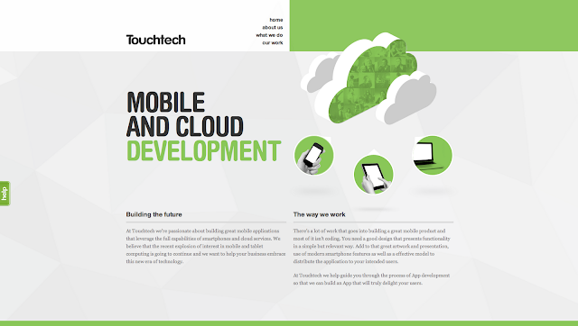 |
| Touchtech’s homepage. |
 |
| Touchtech’s mobile site. |
Owltastic also has a great view for use on mobile devices.
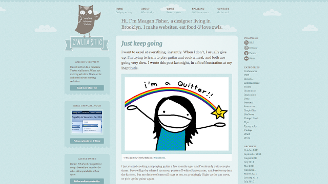 |
| Owltastic’s homepage. Visit it here. |
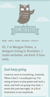 |
| Owltastic’s mobile site. |
How do I tell if my current website is mobile friendly?
If you open your website in a web browser, you can do a very simple test. Resize the browser window until it is significantly smaller in width. If the items do not move and there is a scroll bar at the bottom of your browser, your website is not fluid and possibly may require some adjustments for optimal mobile viewing.
Would you like to make your website friendly for all mobile devices? TBH Creative specializes in website design as well as website usability. We keep up with new technology and growing trends — we will make sure you website looks great on any platform.
Don’t forget iPads and tablets too. Approximately 240 million people own iPads as of this posting.
Don’t forget iPads and tablets too. Approximately 240 million people own iPads as of this posting.
