For this blog I’m going to talk about the 3 different types of development for mobile websites:
- Mobile application vs mobile website (a redirected website or a multi-platform compatible website).
- The difference between an application and a website is that an mobile application that run on mobile phones, usually connecting to the Internet and making it easier to search that application.
- A mobile websites is basically the same as a normal website, except it is designed differently according to screen size.
Mobile Application
Applications have their pros and cons. They are extremely useful in certain situations. Take for instance The Weather Channel App. I have it on my iPhone, whenever I open it up to look at the weather it determines my location and updates me on the weather that is coming in the next 36 hours. I don’t need to go through the Internet, type in the web URL of a local weather station, load the site and then type my location in, and THEN get my weather. I just had to open up an application.There are a few cons to consider as well. One con is that each application must be downloaded — which takes time and space on your phone. And then comes the different mobile platforms and app stores that you can buy/download these apps from. For websites that need customers to check in or buy things from their site, an application is a beneficial tool to invest in for your business.
Mobile Website
Right off the bat, you know that a major pro to a mobile website is that you don’t have to download it, all you need is the Internet to view it. From Ten Digital Trends 2011, there is an section at the bottom called “The Year of the Mobile Website”. They talk about how mobile websites are going to be more feature-rich through HTML5 and media queries. A mobile website could almost match the functionality of an application with these perks. For example here is the weather channel mobile website and mobile app.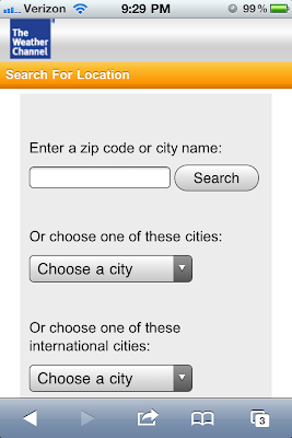 |
| Mobile Website |
 |
| Mobile Application |
The mobile website takes you right to a search feature, the weather channel knows that it’s customers come to search their weather so they put that on the home page of their mobile site. The application automatically brings up my location because I programmed it in already, but basically gives the same information that the mobile website would give if I type in my area code.
 |
| Mobile Website |
The con to creating a mobile website is time and money. This is where the mobile website splits into different categories:
- mobile version of the site or
- a multi-platform compatible site.
Mobile Version of the Site
What would happen is when your site is viewed on a phone, the website will recognize that it is being viewed on a phone and will redirect to a separate and uniquely programmed and designed version of the site. This version will have the dimensions of the screen and will provide the appropriate content that is needed.
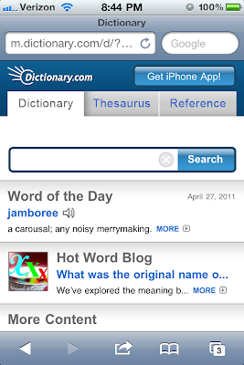
Take for example Dictionary.com: what does it need on it’s mobile website? What are the bare minimums? Well the search feature of course and then a reference and a thesaurus tab, since those are the other sections you can search under and most frequent usage by visitors. Also popular, it offers a button to download the dictionary.com app, and it has the word of the day.
 |
| Mobile Version |
Multi-Platform Compatible Site
This means that your website is built to recognize what platform it is on meaning: if it’s a computer or phone, and what the screen dimensions are. Instead of redirecting to a different version of the site, it will adjust it’s content to match what the user really needs to use depending on the platform and screen size. This way you wouldn’t have to have an entire separate version of the web, you would just have to have extra coding that would recognize and change the way your website looks.
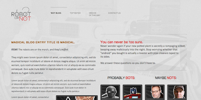
Robotornot is a great example of this. If you change the size of the screen when you view it on a computer, you can watch it adjust it’s design to format what size the screen is.
 |
| Website viewed from a computer |
 |
| Mobile Website (Multi-Platform) |
Summary
To wrap things up, the number one thing to remember when deciding which development path to take for your mobile site is: what do you want your customers to go to first? What is the main purpose of your site? Are you just letting people check in to your business (such as an airport) or offer a shopping cart for product purchase or are letting them search for information that they need? If your answer is yes to any of those questions, we recommend an application custom developed for your website.Otherwise, pick out the top pages you want visitors to see (or think they will be looking for on their phones) and have those showing on your mobile-version website. Out of convenience, we would recommend developing a multi-platform compatible site. In the end, it creates less code which will help your loading time and will take up less server space.
At TBH Creative, we believe that mobile web design is the becoming essential to your online marketing plan and Internet success. While your customers are on the go and need information about your business, they will search for it through their phones. This is why it’s important to have a mobile website.
Ready to revamp your website? Start here
