
What makes a website good is an effective design. I have thought long and hard about what type of effective web design tips to list without leaving the list too long. Here are some of the tips that I came up with. The design needs to include:
- Use white space
- Avoid whole Flash websites
- Use accessible dropdown menus
- Embrace simplicity
- Design with text instead of graphics
1. Use White Space
White space could be a scary thing for a designer and even a client, but it should be embraced. While designing, a designer might think that they don’t have enough pizazz because there is a lot of blank, white space, but this is a good thing. White space is used to help guide your users to the right content. It creates less clutter so the user doesn’t get lost on a page. When the important information that the user needs to know is up front and center and clear to find, the user will be informed. Most visitors will not spend the time to look through the site to find out what the website was about or dig for the details or clarification.Bad – Yahoo
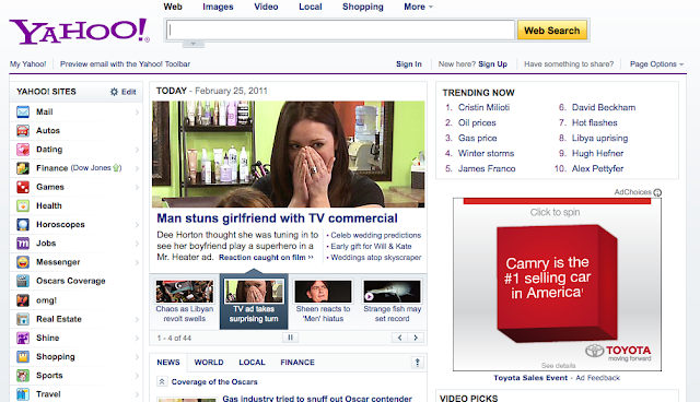 |
| When a user comes to this site, they may not know where to begin. It is cluttered and confusing = overwhelming. One of their competitors, Google, has nailed white space on the head. |
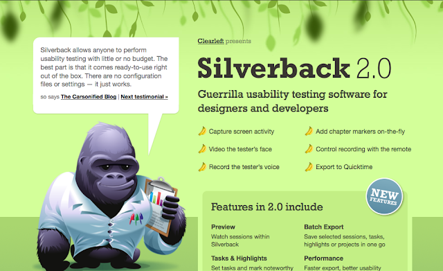 |
| Silverback has a beautiful amount of white space. When a user comes to their site, they know exactly where to find information and which is the most important. Take note: Quickly you can answer ‘what the do’ because it is the biggest font and up front. |
2. Avoid Whole Flash Websites
WHOLE Flash websites should be typically be avoided. I’m not saying to avoid flash all together, but don’t make your entire website with Flash. Flash is really neat to use as a call to action, header, or an interactive piece on your site. Flash is a tricky tool, but the primary reasons that I recommend not using it is because Flash movies aren’t easily accessible and it takes a long time to load (not to mention space on your server).Bad – Manzella’s Fruit Market
 |
| The home page for this site is a little confusing. The user might not know where to click to actually see the rest of their content. Once inside their produce is all listed in links, but if you click on them they don’t take you anywhere. It has too much going on. |
| This is just an application that is made in Flash. It’s a portfolio, it’s simple and it wouldn’t be the whole website. It would only be used to view the portfolio. The only thing about this Flash application is that it could also be developed with JQuery which is why many Flash website are being redeveloped in the lighter weight technology. |
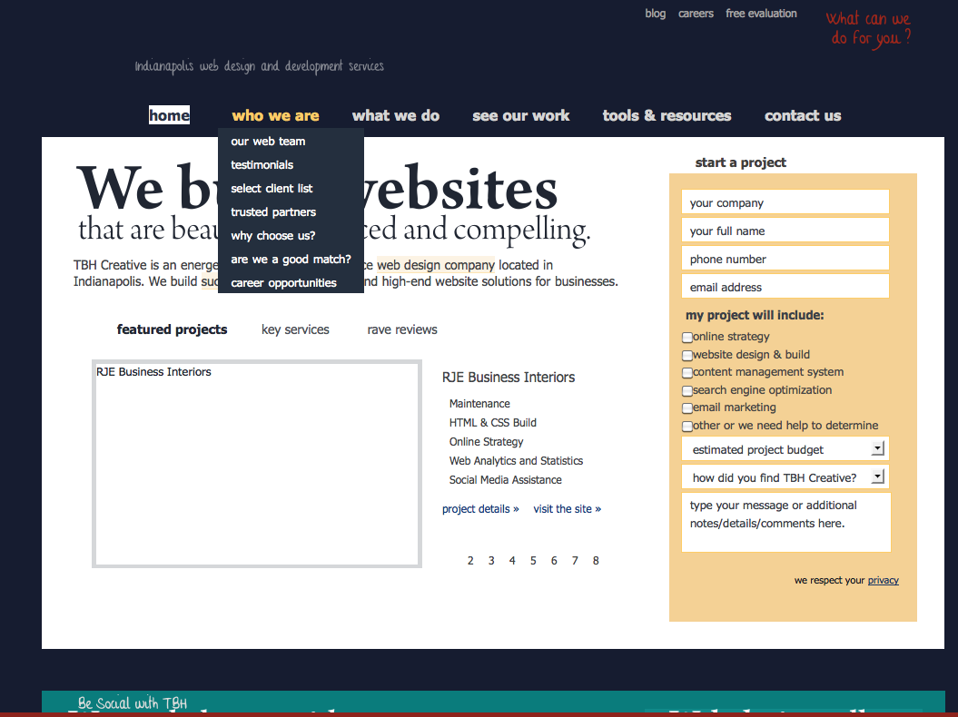
3. Use Accessible DropDown Menus
If it is not necessary to use drop down menus, don’t use them. Drop down menus seem “efficient” but they can be a usability nightmare. I suggest this for one main reasons. Consider visually disabled, or physically impaired people who happen to use the internet for instance.For physically impaired people, drop down menus can be very cumbersome. It is often difficult to keep the mouse on a drop down menu even for people who are not physically impaired.If drop down menus are absolutely necessary in order to save space, make sure to use more accessible drop down menus. “Mega Menus” are even supported by usability experts such as Jakob Nielson. Neilsen supports large, easy-to-hover-over, information-revealing down menus as described in his article Mega Drop-Down Navigation Menus Work Well.
Bad – US Airways
| If the users mouse accidentally leaves the hover state of the drop down, the drop down immediately disappears. This leaves no room for error and the user has to go back and re-hover over the link for the drop down to re-appear. |
| When a user accidentally hovers off of ESPN’s drop down the user is given a couple of seconds before the menu disappears. The user then has enough time to hover back over without have to start all over. |
4. Embrace Simplicity
Simplicity involves many aspects of design. Sticking with a good color scheme is one of them. You don’t have to over do it with a bunch of colors, sticking with few will make the design part go faster and end result often very strong. Check out Kuler or Colour Lovers for inspiration and ideas. Another aspect is white space, which was mentioned above. Again, this helps to not confuse the user while they’re navigating your site. Use all of your design skills wisely and don’t bog your site down with too much information/graphics, often referred to as “over designing”.Bad – Restaurant Guide Atlanta
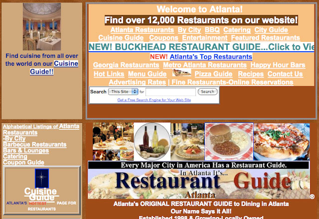 |
| This website is no where near simple, it’s like a country that is on the opposite side of the world that speaks a different language. There are some many different colors happening here and the overwhelming amount of content will definitely confuse the user. |
 |
| This website is the epitome of simple. The colors all flow together and the user will be able to navigate through the site easily. No confusion what so ever. Again, very quickly answering the question: Who are you? |
5. Use Text vs. Graphics When Possible
Two words, loading time. In the fight of text vs. graphics, text will always win. The advantage text has over graphics is loading time. It will always take less time to load text than it will a graphic.The web offers a ton of new fonts to use for websites. You can easily embellish your website with intriguing text and font treatment without having to use graphics. Typekit offers one free font when you sign up for an account and you can pay for additional fonts. Google also offers new web fonts and is growing every day. You can find these fonts at GoogleFonts.
When using graphics, remember to use an “alt” tag in case the images don’t load. This will leave text where your images would be so that the user can read it and also for disabled users who use screenreaders to browse your website.
Bad – April Zero (loaded with and without images)
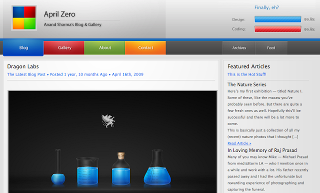 |
| With images: this site looks beautiful. But what happens when the images won’t load? |
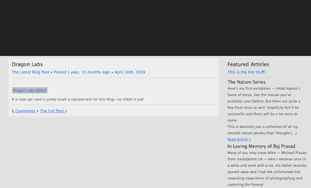 |
| Without images: ummmm where did the navigation go? How about the logo? At least there was an “alt” tag for their dragon lab image. |
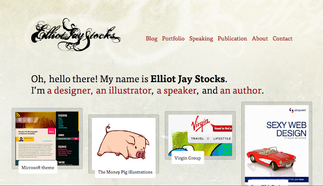 |
| With images: this site is pretty simple, and it definitely helps them out when the images won’t load. |
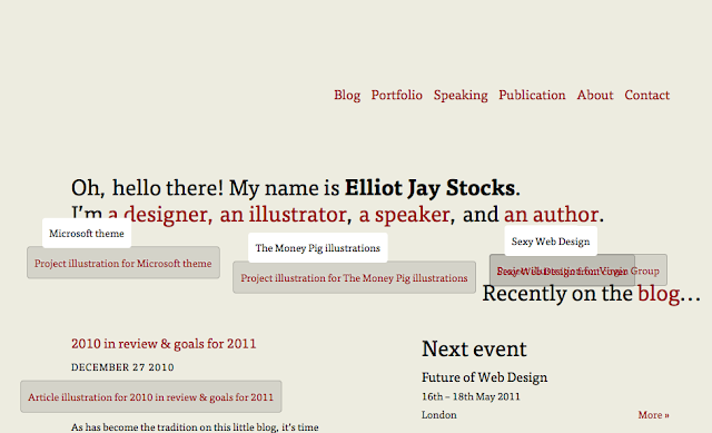 |
| Without images: okay their logo disappeared, but the slogan is still there as well as the navigation. The only problem with this is the overlapping text from the alt tags, but at least they are tagged. |
| With images: We have used graphics and text combined. |
 |
| Without images: As you can see, the majority of the design composition stays in tack. One trick we use is background colors behind colored graphics. |
To conclude this blog, I just want to acknowledge that there are plenty more tips for effective design, but you should definitely use these tips with all of your designs. Remember that when you use Flash to evaluate the need and other options, and text the accessibility of your dropdown menus. Also pick a great color scheme and don’t over pack your site with colors just to make it look more creative, because it could get messy or cluttered.
The last tip I’m going to leave is to keep up with CSS3 — it is changing websites as we speak. There is so much you can do with it from the animation I mentioned, to drop shadows, to rounded corners, and even gradients. Don’t hesitate to use this to your advantage to help minimize your loading time.
Building a website and doing nothing else is not enough in today’s online market. Web design and web development trends as well as website technology are constantly changing. For a business website to succeed, you need to have an expert on your team constantly evaluating visitor trends, design, usability and accessibility. TBH Creative would like to help.
Let’s start talking