I read through this blog about 2010 trends in web design because I wanted to see how accurate it was for 2010. The blog was written in November 2009, a year ago from today! They listed 14 trends that would be featured in 2010 along with their main purpose.
After skimming through this article, I would say that everything was DEAD on. The only one I have to question is Interactive design through Flash. I still love Flash and feel that it could be implemented lightly in a site, but not as the WHOLE site. They did give an excellent example of a site that was built all in Flash, but the fact that people who do not have Flash cannot view it bothers me (e.g. iPad and mobile devices). AS another option, jQuery has jumped in and made a huge impact for people that still want to use animation.
After reading this article, I thought I would see what I could come up with for possible trends for 2011. I repeated a few of the 2010 trends, because they were good and will surely be used again in 2011. I used CSSElite and CSSDrive to sift through websites and check out the trends.
1. 3D Effect/Wrap around Boxes
I believe that this is becoming a trend because EVERYONE is talking about 3D. Video games are huge, the movie theater has 3D and now you can even buy a 3D tv for your home. So although we don’t have a 3D computer screen, yet, we sure can design to make it SEEM 3D.
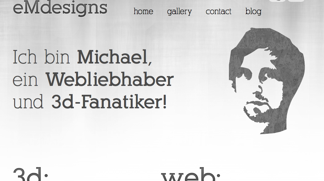
2. Hand Drawn Images/Cartoon Images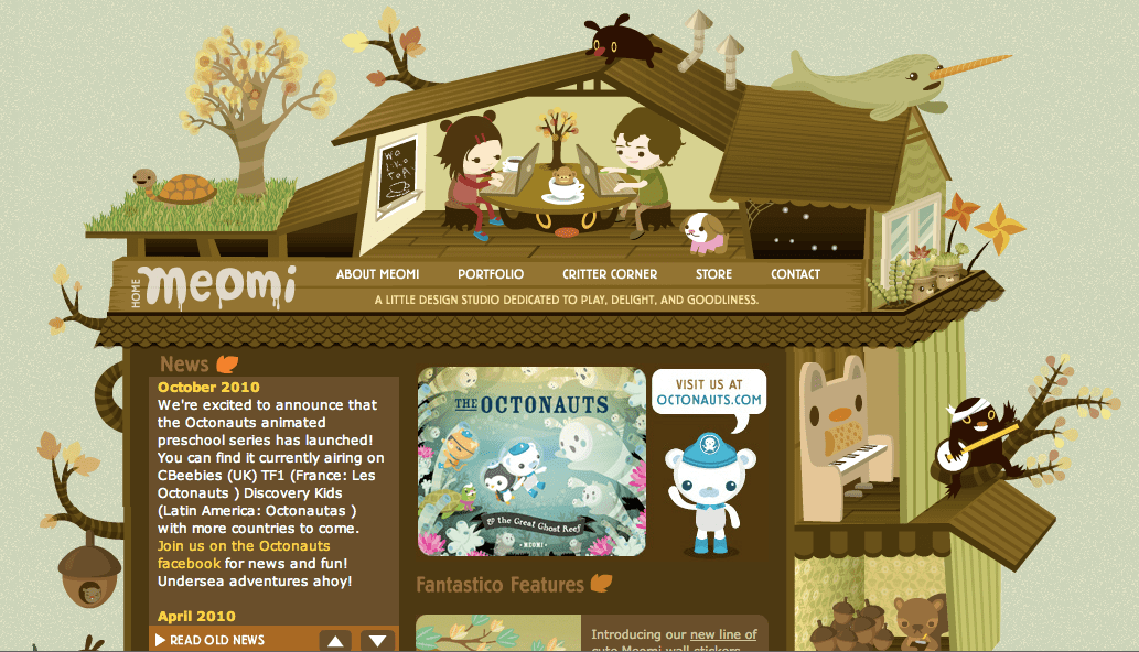
The website above is an example of the Cartoon Images. I’ve seen a lot of them in web design for 2010, and believe we will see more in 2011.
I did want to say one thing about this website sample above. I found this site on CSSDrive, I clicked on it believing that it was just a cartoon image website that looked pretty neat. As I went to the site, I realized that it is Flash. So although I don’t think that entire websites should be made in Flash (because it’s not accessible for everyone), this is one of the best Flash sites that I have seen AND the Flash wasn’t made to make everything look fancy — it’s interactive. So I would say check this site out and have fun!
I did want to say one thing about this website sample above. I found this site on CSSDrive, I clicked on it believing that it was just a cartoon image website that looked pretty neat. As I went to the site, I realized that it is Flash. So although I don’t think that entire websites should be made in Flash (because it’s not accessible for everyone), this is one of the best Flash sites that I have seen AND the Flash wasn’t made to make everything look fancy — it’s interactive. So I would say check this site out and have fun!
I feel that this trend is self explanatory. If you are an awesome artist or know someone who has artist talent, have them draw you something AWESOME to put on a website! This concept kind of puts a personal touch on a website, especially if it is a personal type of website because it shows the real you.
3. Black and White Icons/Buttons, On Hover become Color
Wooo, that was a mouthful, but with some examples it will become more clear.
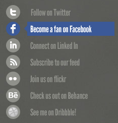
This design trick adds an element of surprise for the user, which is always nice. I do believe it is becoming a trend. Even Blogger uses this trick with its social icons below each post.
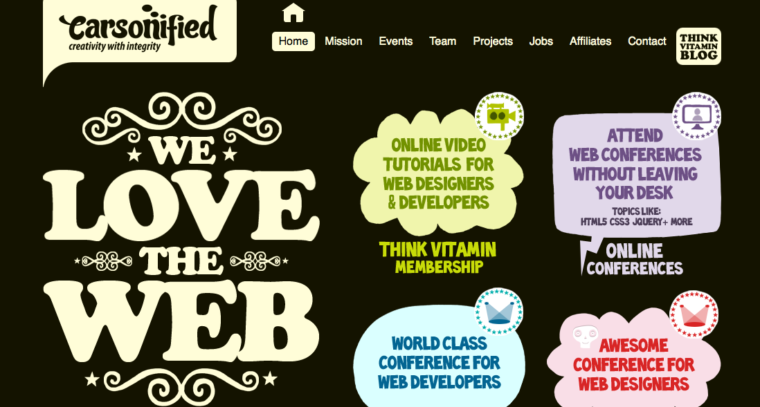
4. Large Headers
Large, elaborate, exquisite headers. They’re IN!
This is a trend used to capture the users interest. It takes the user on average 10 seconds (or less) to decide if they are going to stay on a website. This is where big headers come into place. They explain what that website is about, grabs the users attention, and it is the first thing that the user sees.
5. Typography
Typography is used to make a website more interesting. If used right (which is difficult if you don’t know much about type), you can make a beautiful website. Using typography can also help a website look clean and neat. It hasn’t been easy using different fonts for a websites actual font (I’m not talking about images that include font), but we now have Google Font Directory and websites like TypeKit. These sites allow web developers/designers to use new fonts on their website instead of the default fonts that have been around forever.
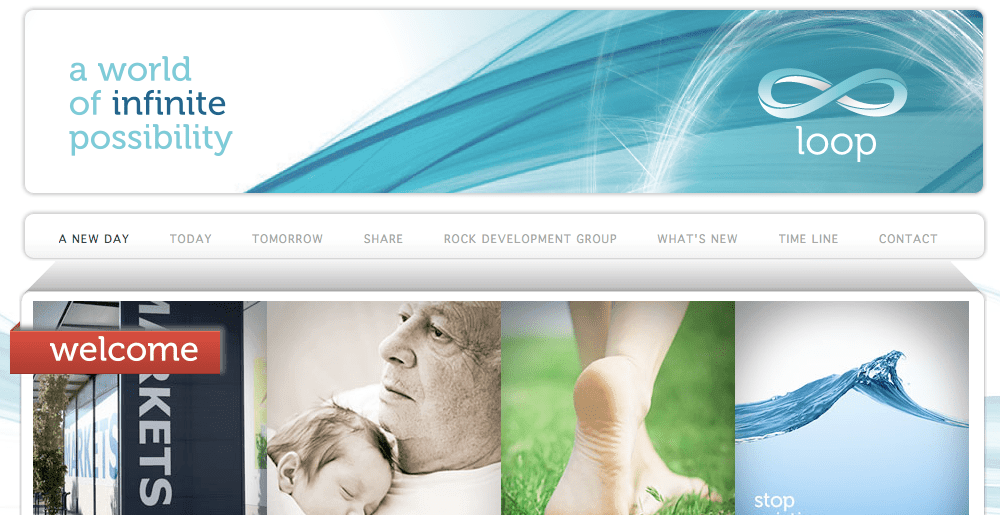
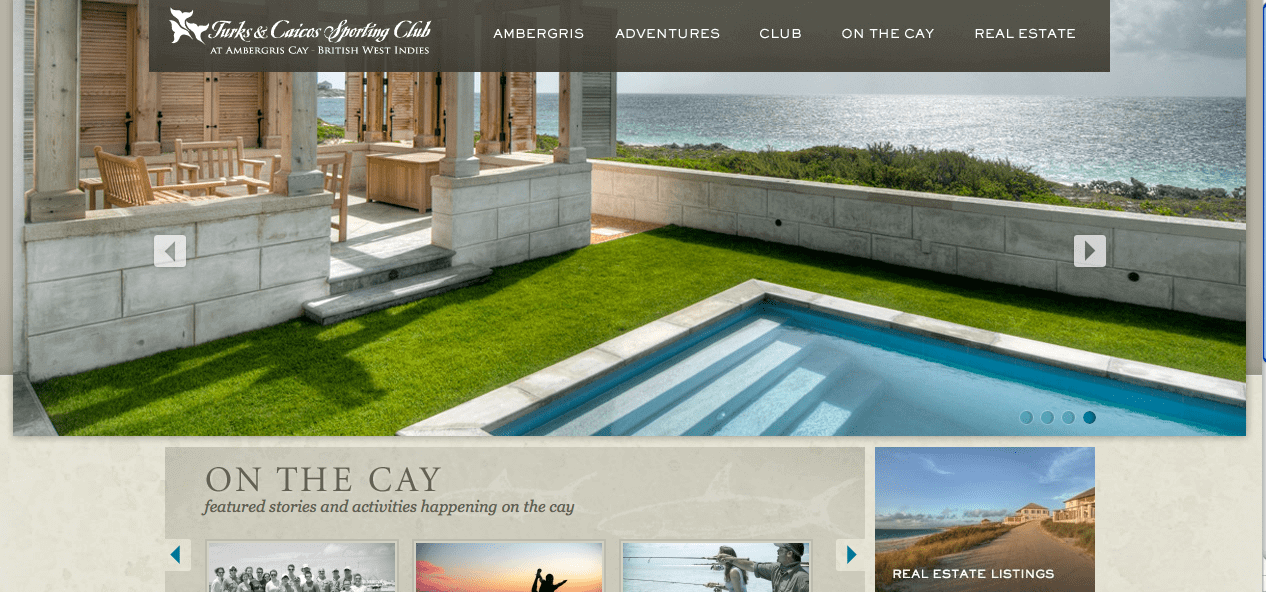
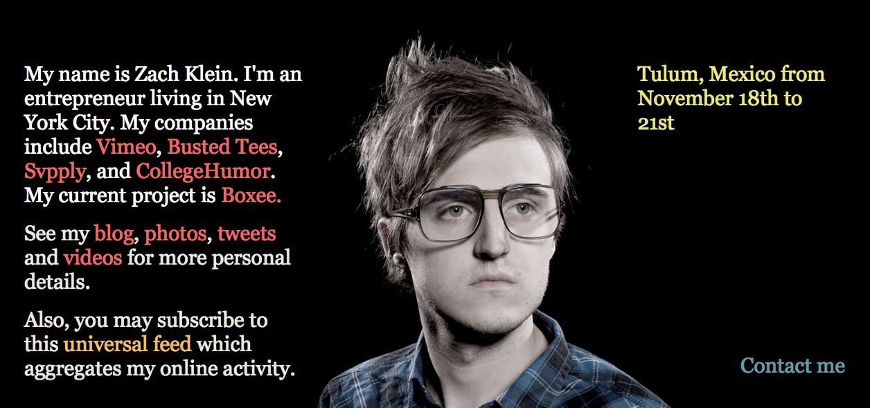
6. One Page Layout
I think that this goes two ways. In the blog for 2010, they gave an example of a website that had all of the information on it that was contained in the screens dimensions. I would say that this is definitely included in a trend, but I don’t want to leave out the websites that have all of their content on one page, but still have a navigation that will take the user down to that certain content. To me, this is more of a trend than an actual one page layout.
I’ll show the design from the other blog first and then the one that I picked to show the other type of one page layout.
and then….
If you click around on the navigation, the page moves from top to bottom showing you additional information. This is more of a trend to me then the first website I posted above.
7. Simple/Minimalism
This trend is becoming more and more prominent because the user spends less and less time on a website. With a simple website, the user can read the first line on the page and know what the website is about. This is also useful for mobile phone, there isn’t a lot of space to design so the trend has become white space, white space, white space, minimal design. This is effective when you have a small space and have to focus on just the main part of the website.
8. Big Footers
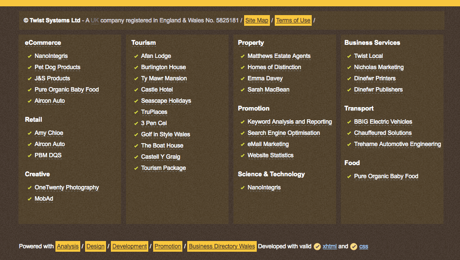
Those are the trends that I for see for 2011. Some trends have carried on through the years, but there are always new and exciting trends that pop up. I encourage readers to post any additional comments or trends that they think will show up in 2011.
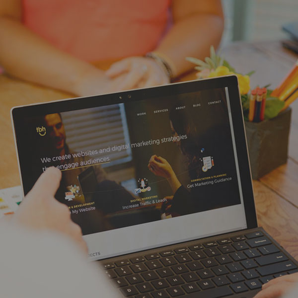
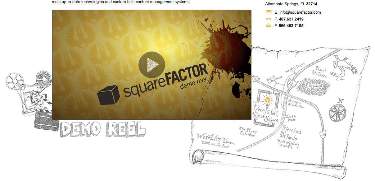
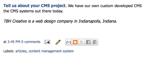
TBH Creative is a small and energetic website company in Indianapolis. We offer a custom developed content management system for flexibility, easy in-house maintenance, and robust functionality.
Contact us to get started